PERFECT BASE FOUNDATION STICK
Company: Rude Cosmetics
Co-Designer: Kira Chang
Copywriters: Stephanie Ramos, Fanta Gai
Photographer: Mikolaj Szozda
ART DIRECTION | CREATIVE DIRECTOR | PACKAGING & COMPONENT DESIGN | ADVERTISEMENT | PHOTO EDITOR & RETOUCHER
TIMELINE: October 2025 - March 2026
RELEASE DATE: July 2026
PROGRAMS: Adobe Creative Suite, Blend Translations, WeTransfer, Shutterstock, Procreate
As the lead designer for the Perfect Base collection, I was responsible for the complete creative direction, art direction, and packaging design for what would become Rude Cosmetics' dedicated base makeup line. The collection began with the Perfect Base Foundation Stick, establishing the visual identity for an entirely new category within the brand. Prior to this launch, Rude did not have a cohesive collection dedicated to complexion products, so the challenge was to create a recognizable system that could grow alongside future base makeup releases while remaining unmistakably Rude.
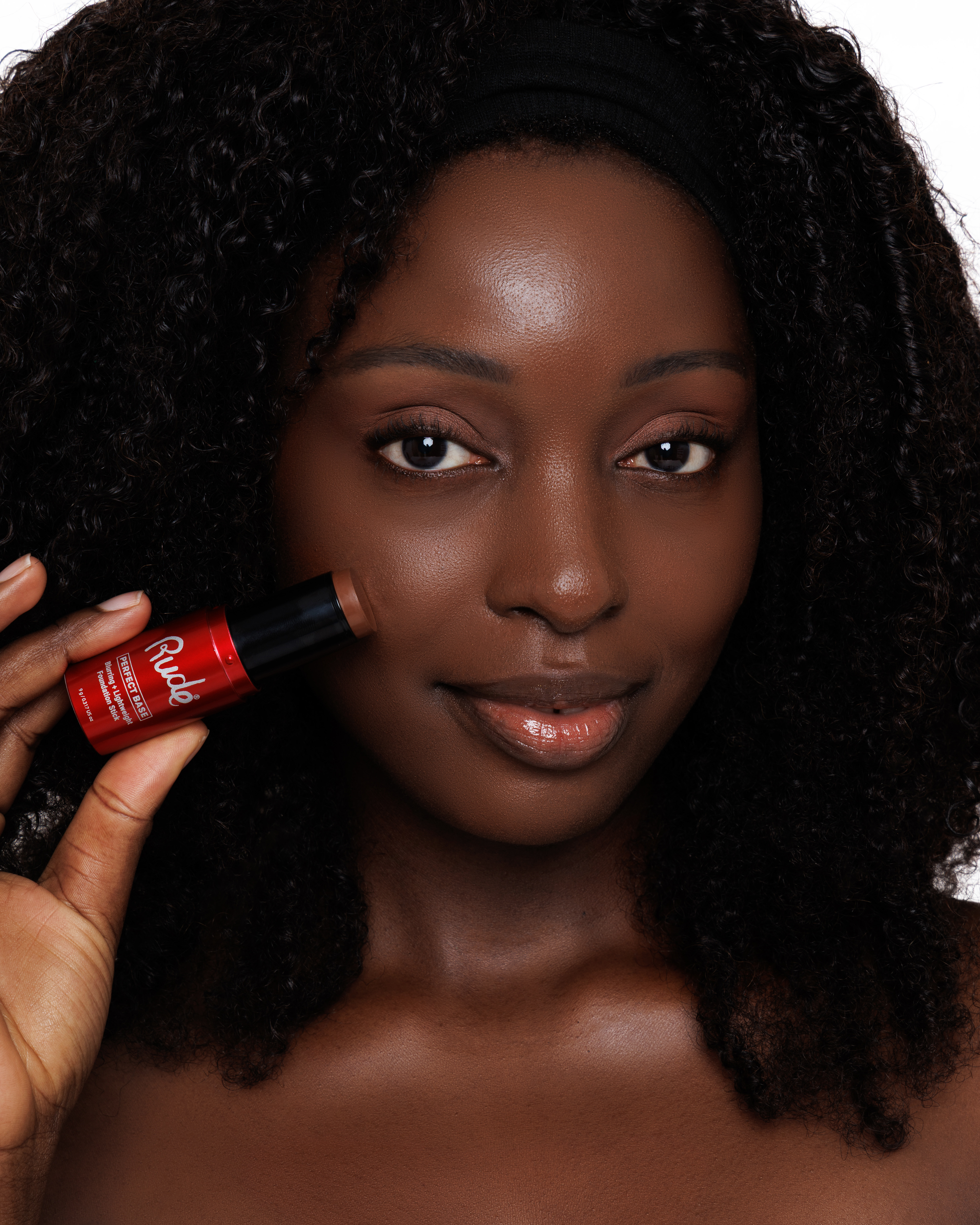
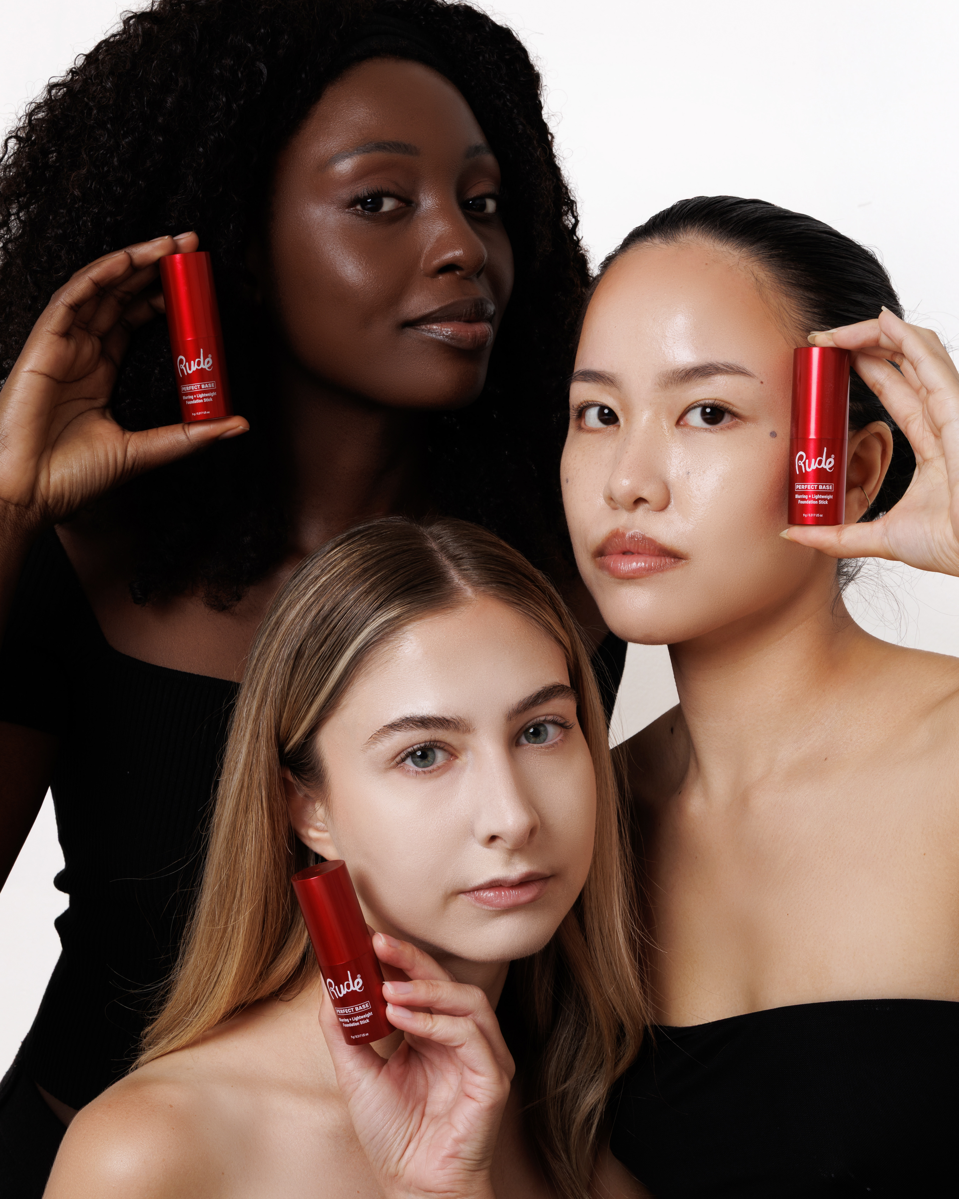
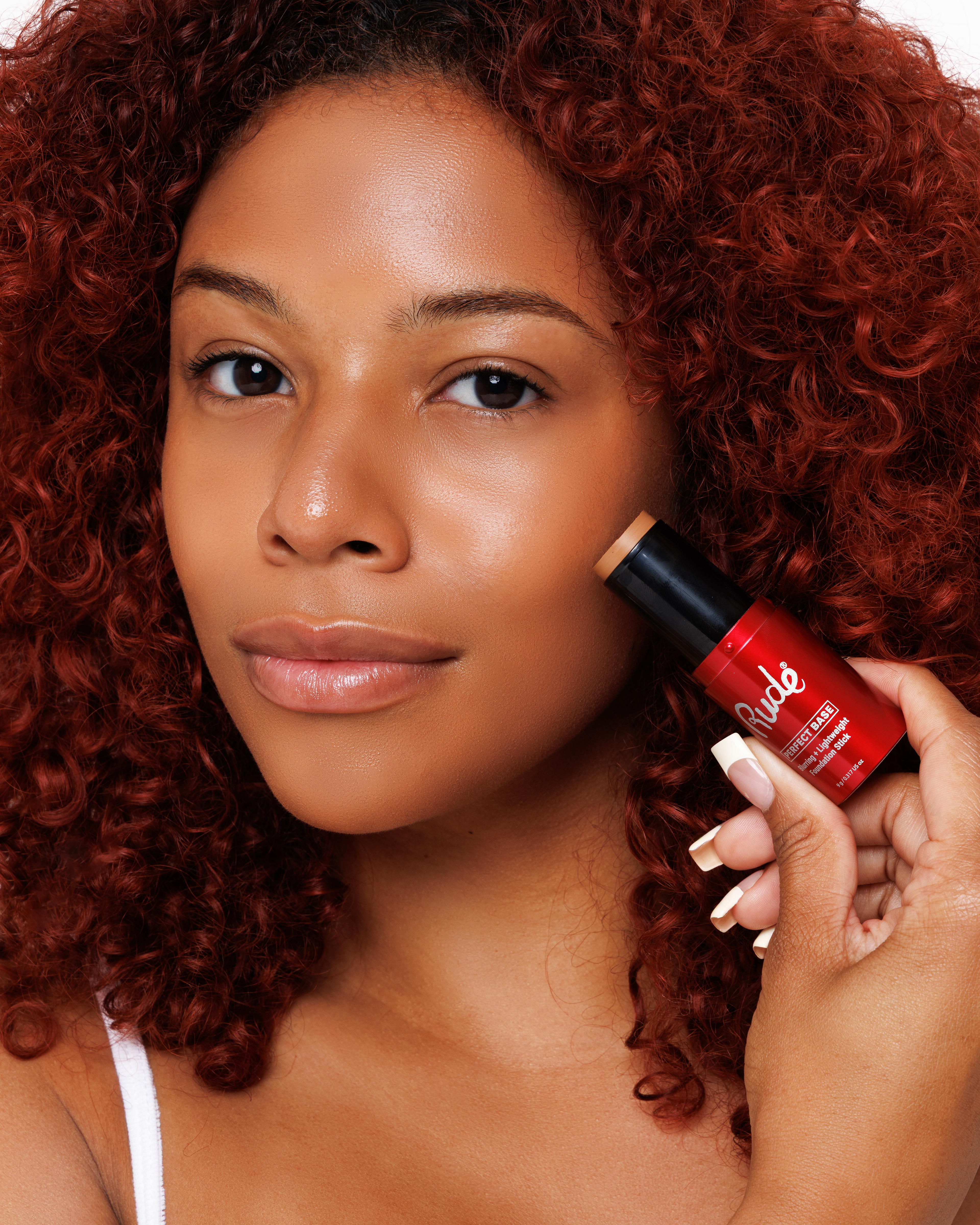
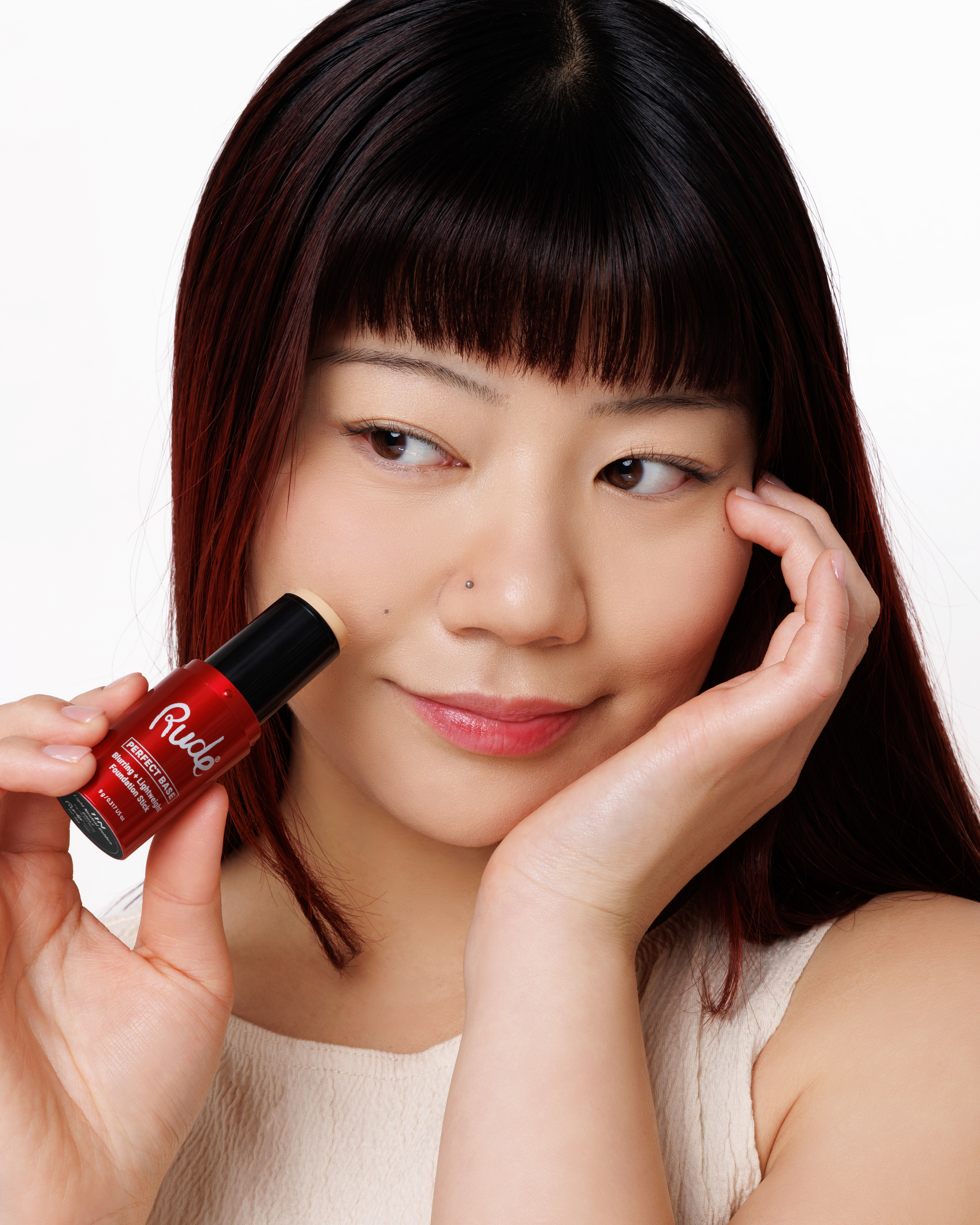
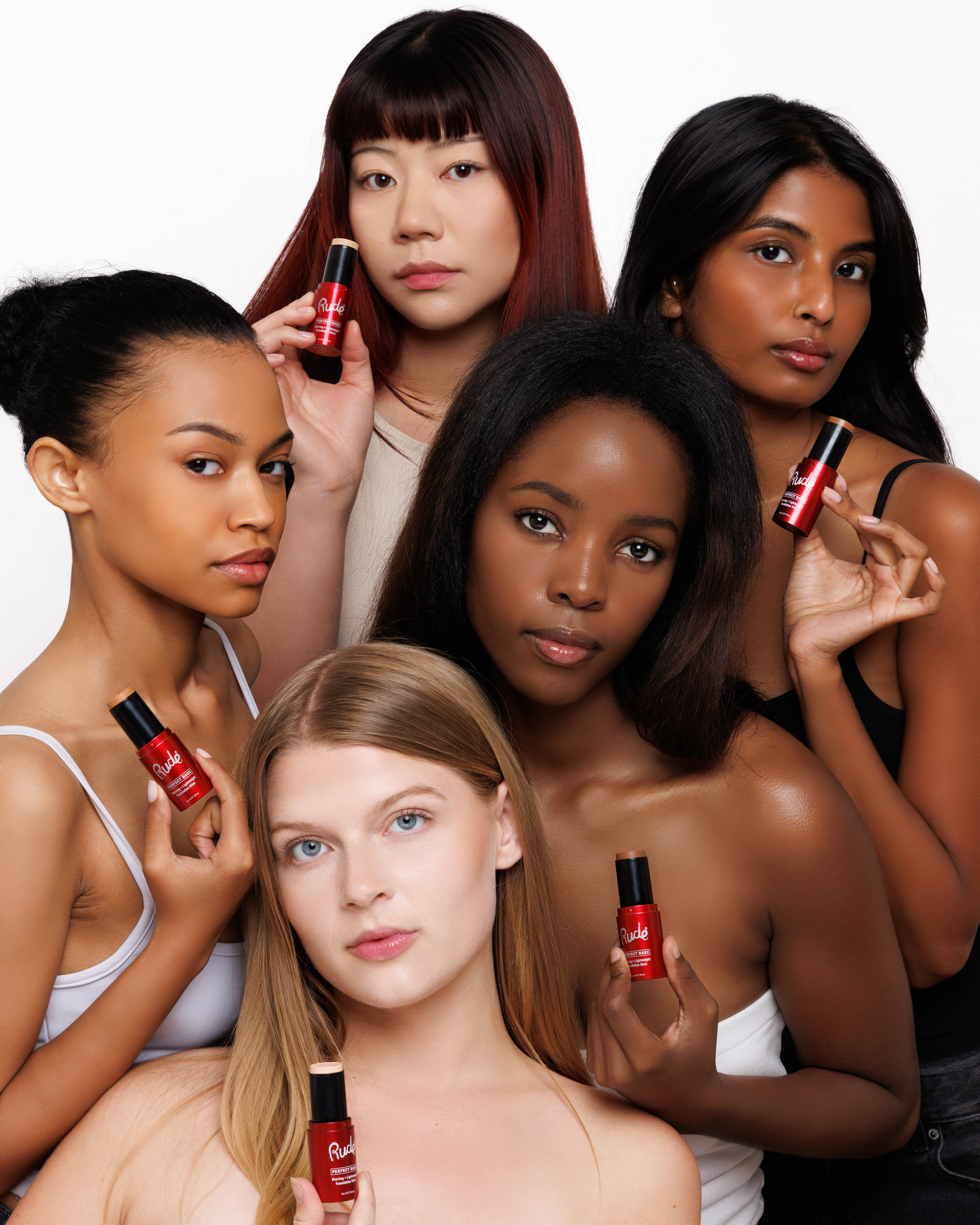
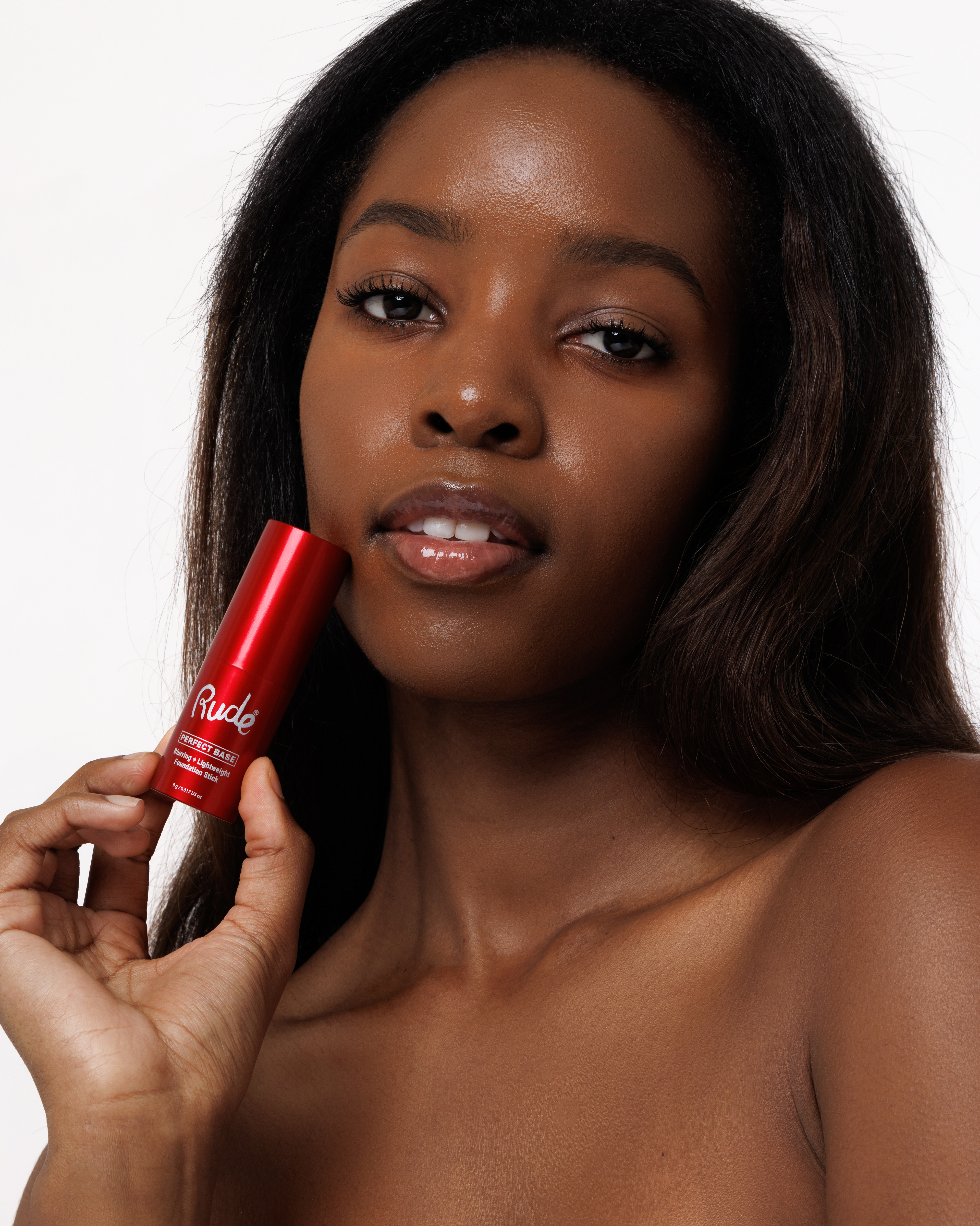
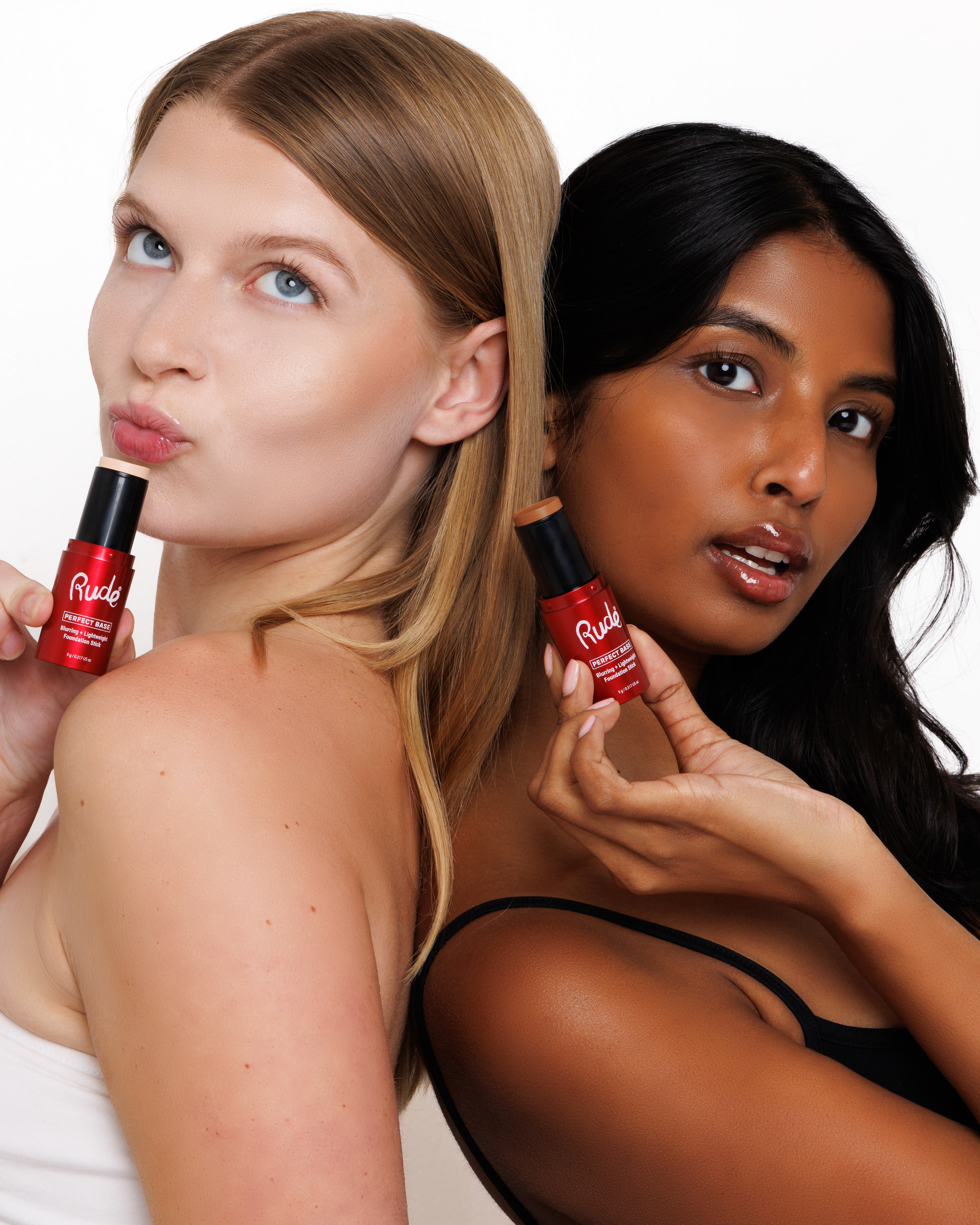
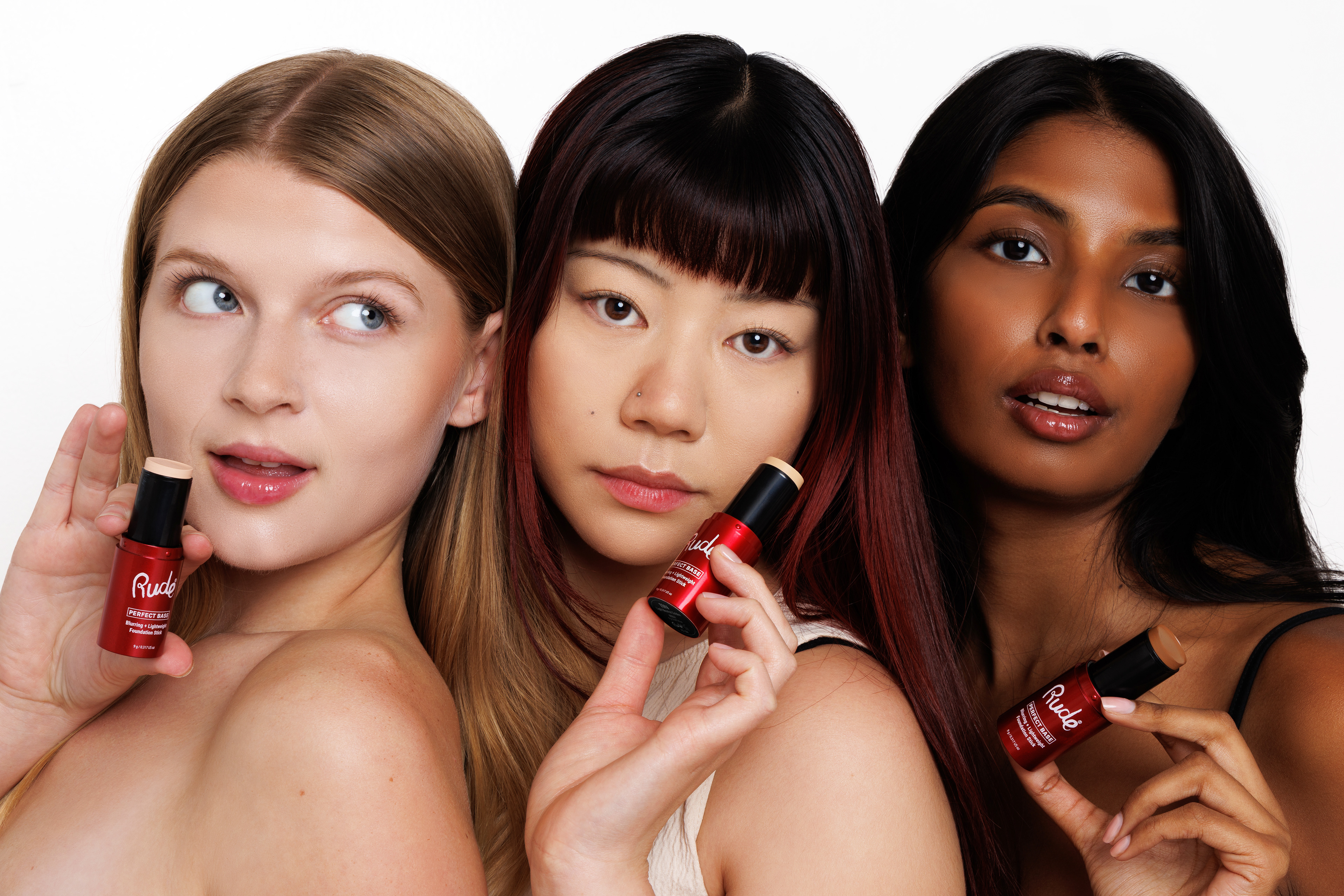
A key goal throughout the creative process was to place a greater emphasis on diversity and inclusivity. Since complexion products are made to serve people across a wide range of skin tones and backgrounds, I wanted the collection to feel welcoming, authentic, and representative of the individuals using it. This vision informed the art direction from the beginning, with campaign imagery that highlighted a diverse range of models, skin tones, and unique features. By prioritizing inclusive representation alongside a cohesive visual identity, the Perfect Base collection established a strong foundation for Rude Cosmetics' future complexion products while creating a campaign that felt more reflective of its diverse customer base.
LOGO DESIGN
The Perfect Base logo was intentionally designed with a clean, minimal aesthetic to create balance within the overall visual identity. By keeping the typography simple and understated, the logo allows the bold packaging elements to take center stage while remaining timeless and adaptable across future products in the collection. Its understated design reinforces the idea that the products themselves provide the perfect canvas for every makeup look.
PRODUCT DESIGN
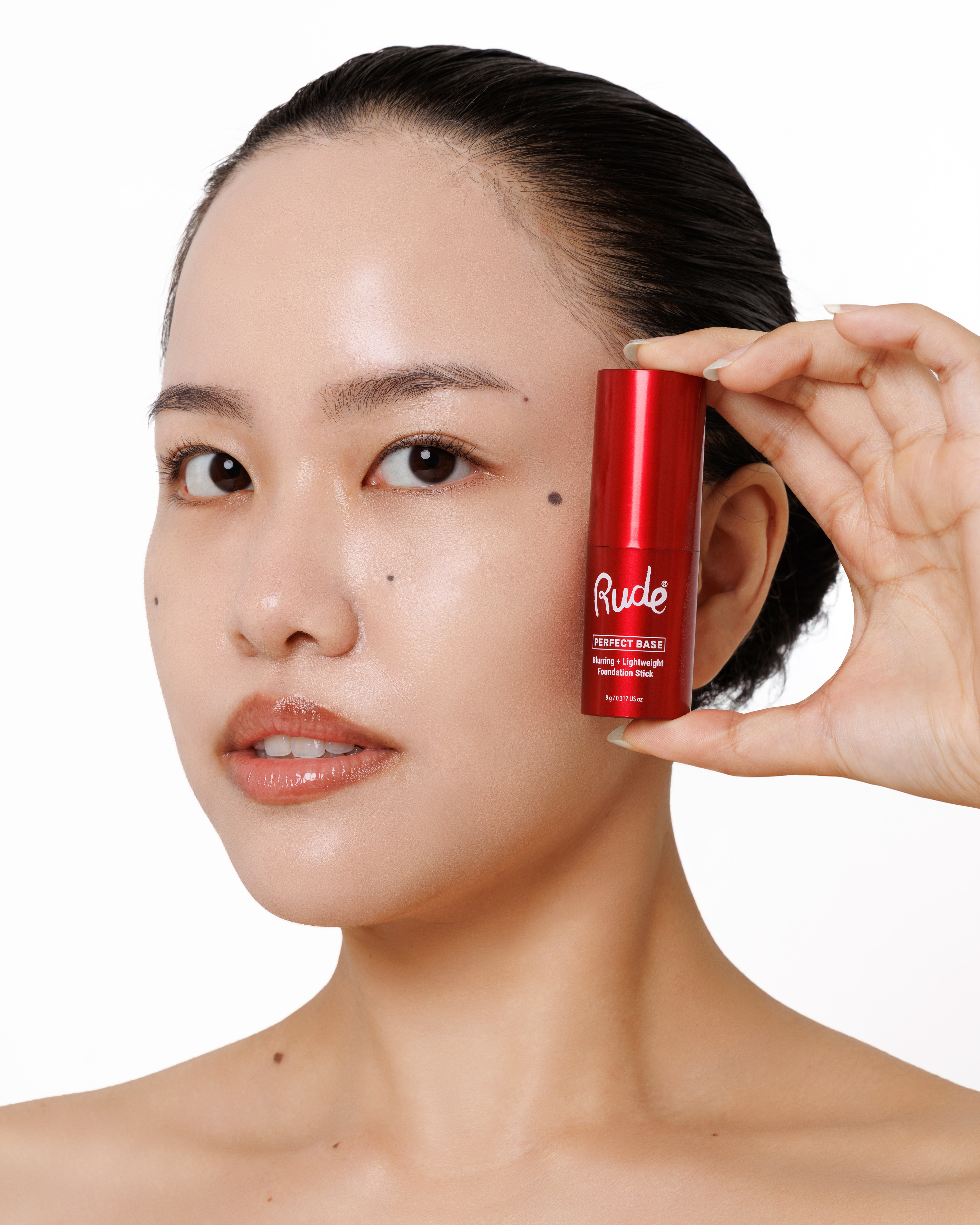
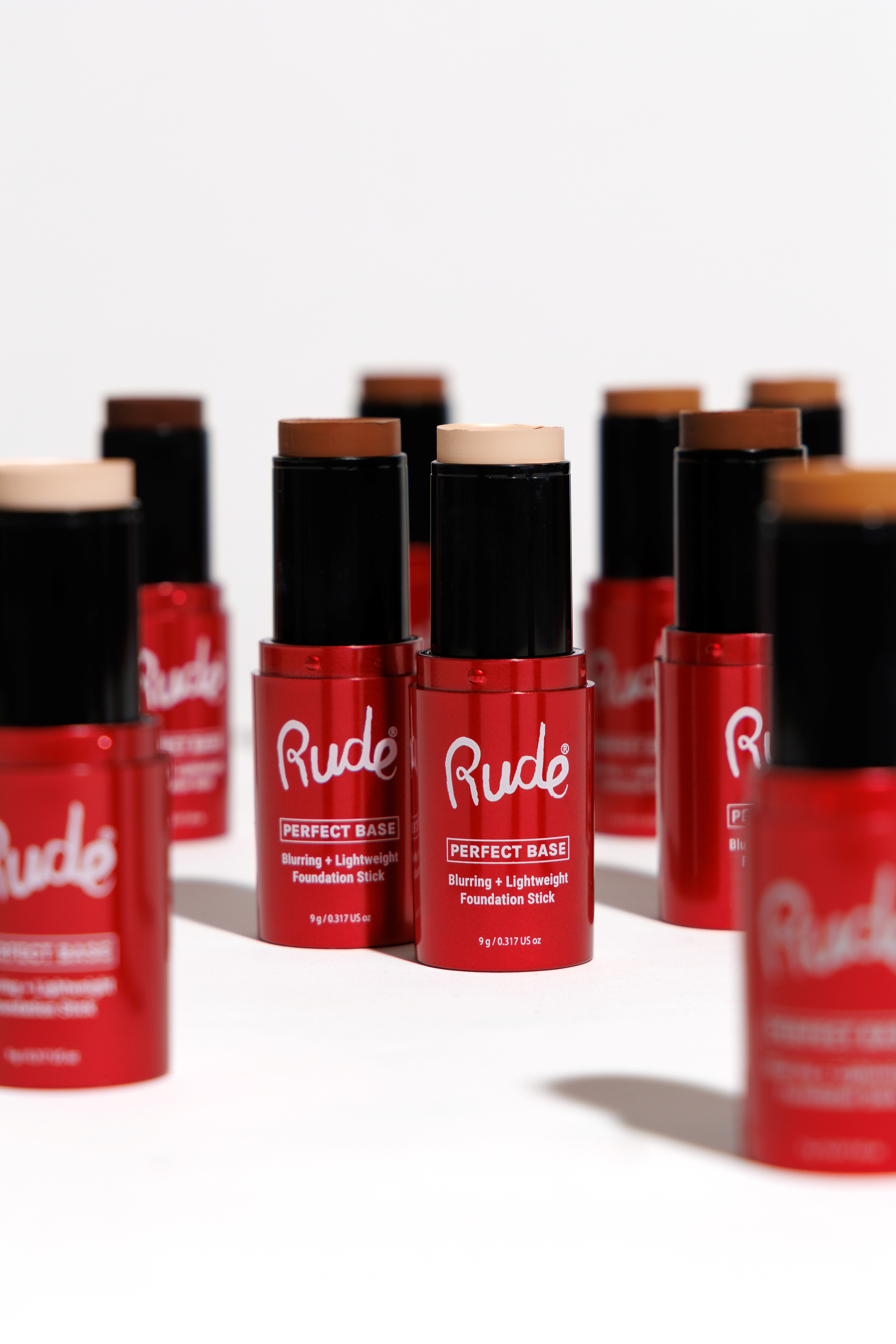
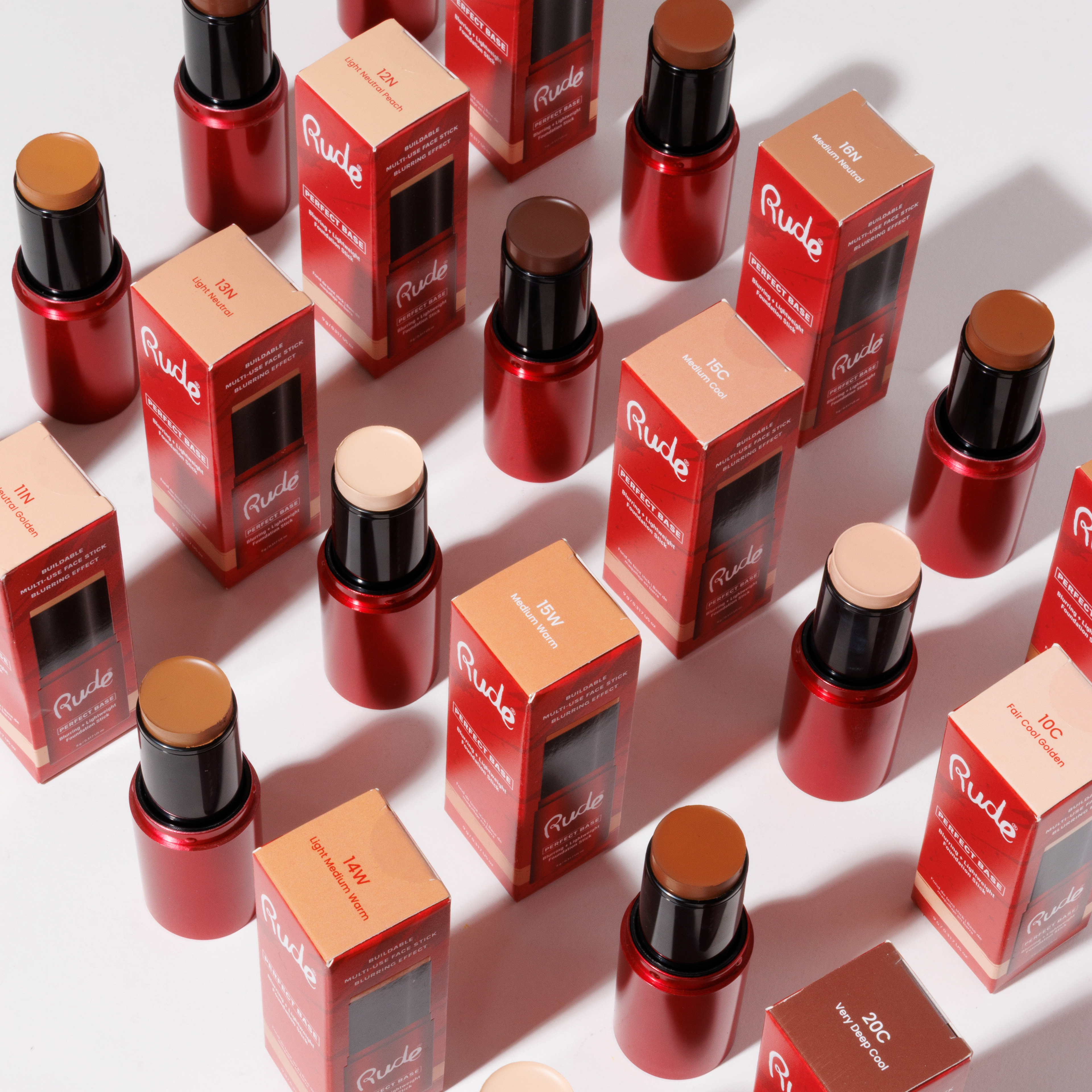
The packaging design centers around Rude Cosmetics' signature red, transforming the brand color into an instantly recognizable identifier for the collection and strengthening its connection to the overall brand. Expressive brushstroke graphics were incorporated to represent Rude's bold personality, creativity, and freedom of self-expression. The dynamic strokes add movement and energy to the packaging, creating a scalable visual system that is both eye-catching on shelf and flexible enough to expand across future complexion products while maintaining a cohesive identity.
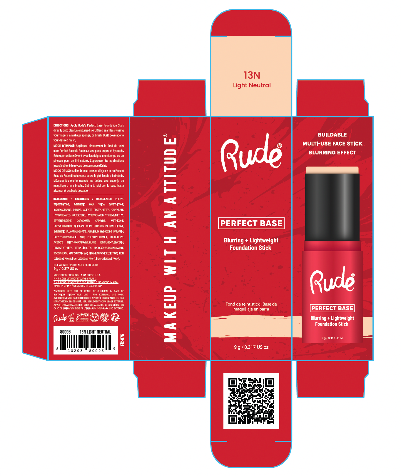
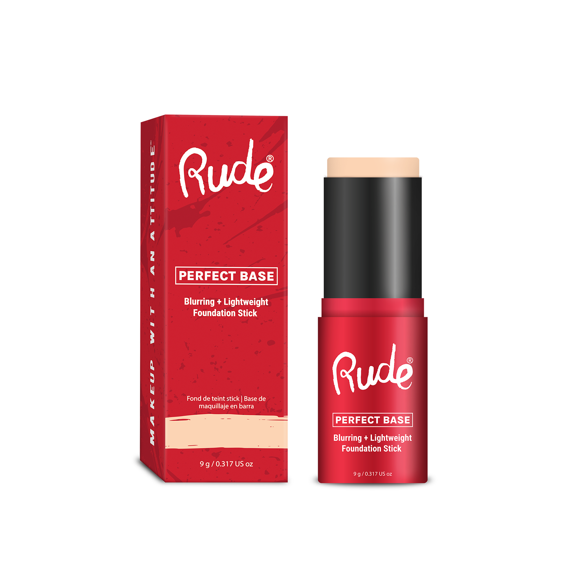
FINAL PRODUCT
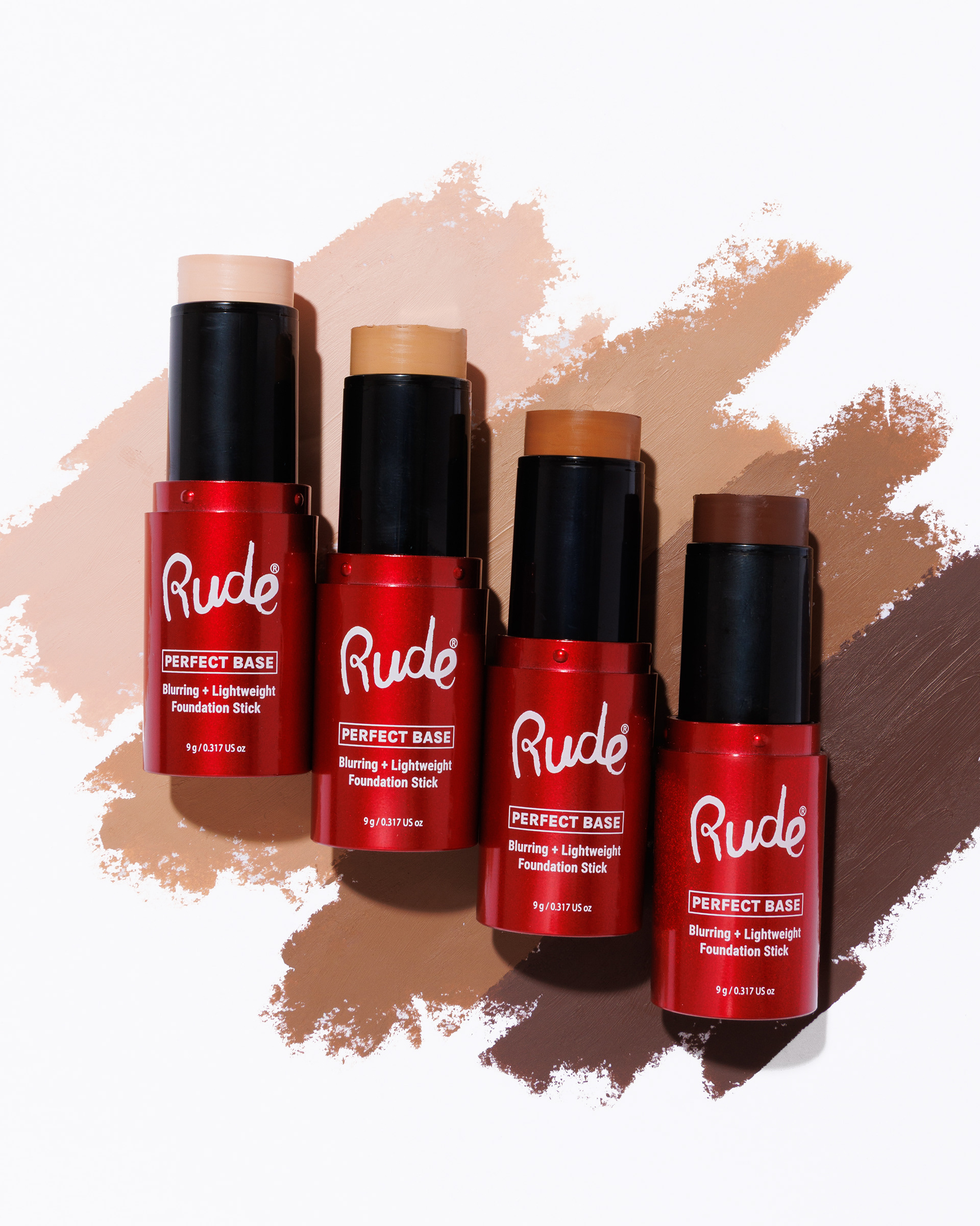
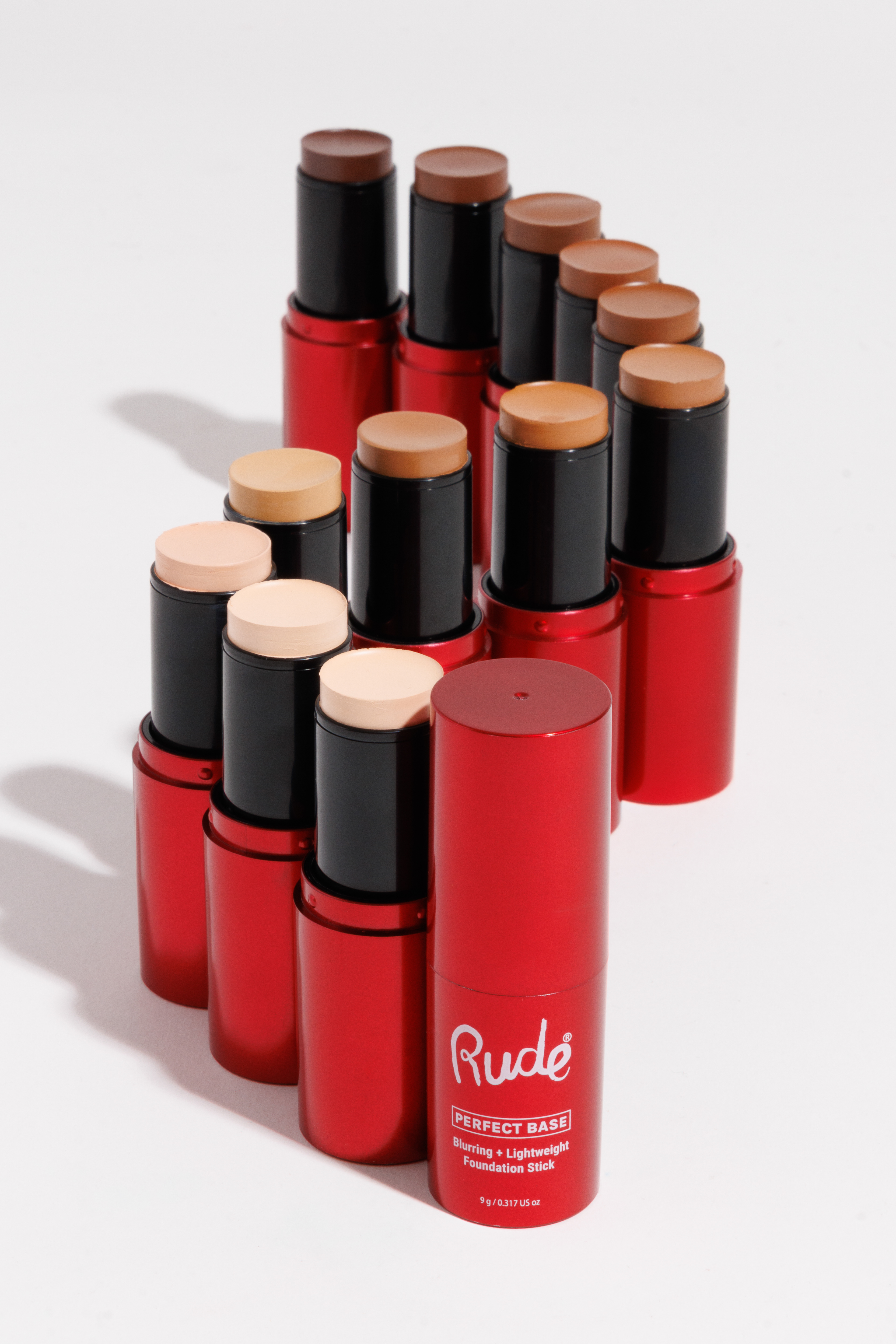
MODEL PHOTOS